EXPERIMENT ONE
Pre-Week 01
Pre-Week 01
Creative Work (Photograph)
Location: Pyongyang, North Korea
Date: September 2019
This was a picture I had captured in September of 2019 which features a man pushing his bicycle (the most common form of private transportation), against the backdrop of Kim Il Sung Square. This is one of the few location foreign tourists are allowed to visit.
Architecture
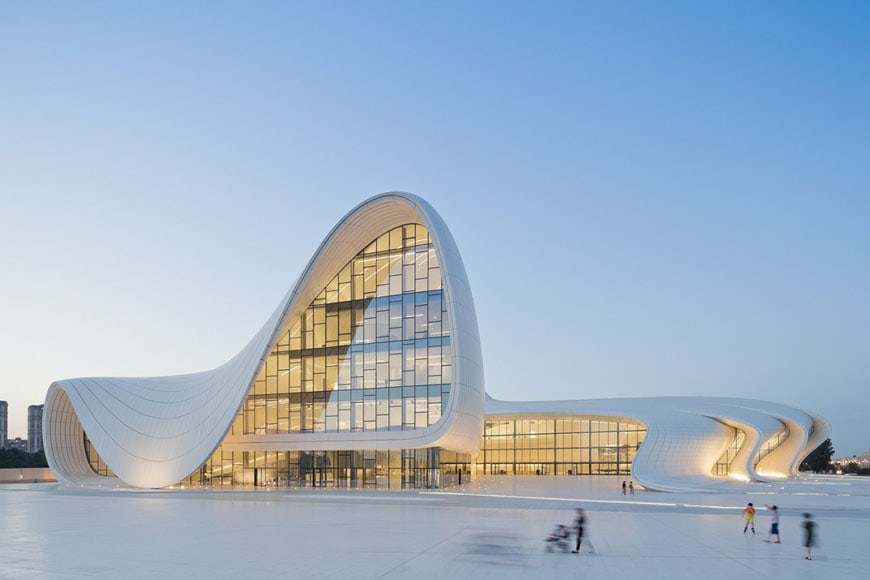
Project: Heydar Aliyec Center (Azerbaijan)
Architect: Zaha Hadid Architects
This project was designed by Zaha Hadid Architects from 2007 with the idea of presenting a continuous and fluid surface which links both its interior and exterior as well as the urban landscape which envelopes it. Praised for its consideration of both contemporary and traditional Azeri culture, this project was presented the top award in Designs of the Year in 2014. It still stands as an important cultural centre, featuring exhibition spaces, a library, museum and concert venues.
Photograph

Subject: Impressions of Lijiang Performance
Director: Zhang Yimou
This photograph shows part of an outdoor singing and dancing performance which is held to show the customs of the people who lived the land around the Ancient Tea Horse Road. It is held 3100 metres above sea level against the Jade Snow Mountain and features approximately 500 amateur performers hired from the surrounding villages.
Week 1
Creative Works - the_kyza
Noun: Wave
Verb: Conjoining
Adjective: Distinctive
Creative Works - mountainandmoon
Noun: Link
Verb: Interlock
Adjective: Voguish
Creative Works - trent jansen
Noun: Canvas
Verb: Affix
Adjective: Geometric
18 Sections
Sketch-Up Model
Associated Words: Link, Geometric
Material Selection: Exposed concrete structure with glazed windows and white marble flooring.
Week 2
Stair Design One
Stair Design Two
Stair Design Three
Stair Design Four
Week 2 Chosen Stair Design 3D Modelling
Eye-Level View
Top View
Bottom View
High-Angled View
Description
This is a spiral staircase constructed to reflect the various materials, colours, forms and features of the jewellery created by Mountain & Moon. In particular, the use of hued gemstones in the earrings and necklaces is reflected through the opaque shards of glass which form as part of the handrail design and shattered shape of each tread in the stair.
It was created to reflect the following section:
Week 3
Section Designs
Week 3
Two simple shapes integrated into building.
1. Mountain & Moon Jewellery
2. Trent Jansen Studio
Textures Applied onto Section
Texture One
Texture Two
Texture Three
Sketch Up Progress
Initial Design
This is the design initially created from the section. Reflecting on the plain and stiff nature of this building created, I decided to use some of the inspiration from this building to start re-designing a new building. From this building, I liked the idea of allocating the top level to Mountain & Moon with ensures maximum sunlight along with the plentiful use of glass instead of concrete walls. As well as this, I did like the design of the top section which I decided to use and remake.
Progress
Using the top section previously created, I attempted to make it a more open space along with privacy through the curtains when necessary. This will ensure that all the sunlight will reflect on the jewellery.
Current
The current building design builds on the progress photo by adding more character suitable to both of the clients. Applying colours and the textures as well as adding chains and geometric objects attempts to address the two works "Link" and "Geometric"
Youtube Video
Week 4
3 Sectional Perspectives
3 Sectional Perspectives
Link to 3D Warehouse
https://3dwarehouse.sketchup.com/model/c9ed3736-a402-4c7a-b7ba-941da0cf77fe/EXP1-ARCH1101-Kathy-Chen-2020
EXPERIMENT TWO
Week 1 - Circulation Cross and Massing Element
3D Construction of Massing Elements
Article
Week 2- Architectural Plan
via Imgflip
Week 4- Review and Finalisation
EXPERIMENT TWO
Week 1 - Circulation Cross and Massing Element
Circulation Cross on Lumion
Circulation Model + Massing Elements
3D Construction of Massing Elements
Lumion Render
Reference:
Bryson, Brandon. "Driving Architectural Simplicity- The Value, Challenge, and Practice of Simple Solutions". InfoQ, 17th August 2017. https://www.infoq.com/articles/driving-architectural-simplicity/
Key Words:
Organisational
Comprehension
Quality
Quality
Modification
Theory:
In architecture, simplicity is an under-appreciated quality which synthesises the best combination of clear organisational structure, unlimited modification opportunities, and an improved comprehension from both the designer and the user.

In architecture, simplicity is an under-appreciated quality which synthesises the best combination of clear organisational structure, unlimited modification opportunities, and an improved comprehension from both the designer and the user.
Bridge


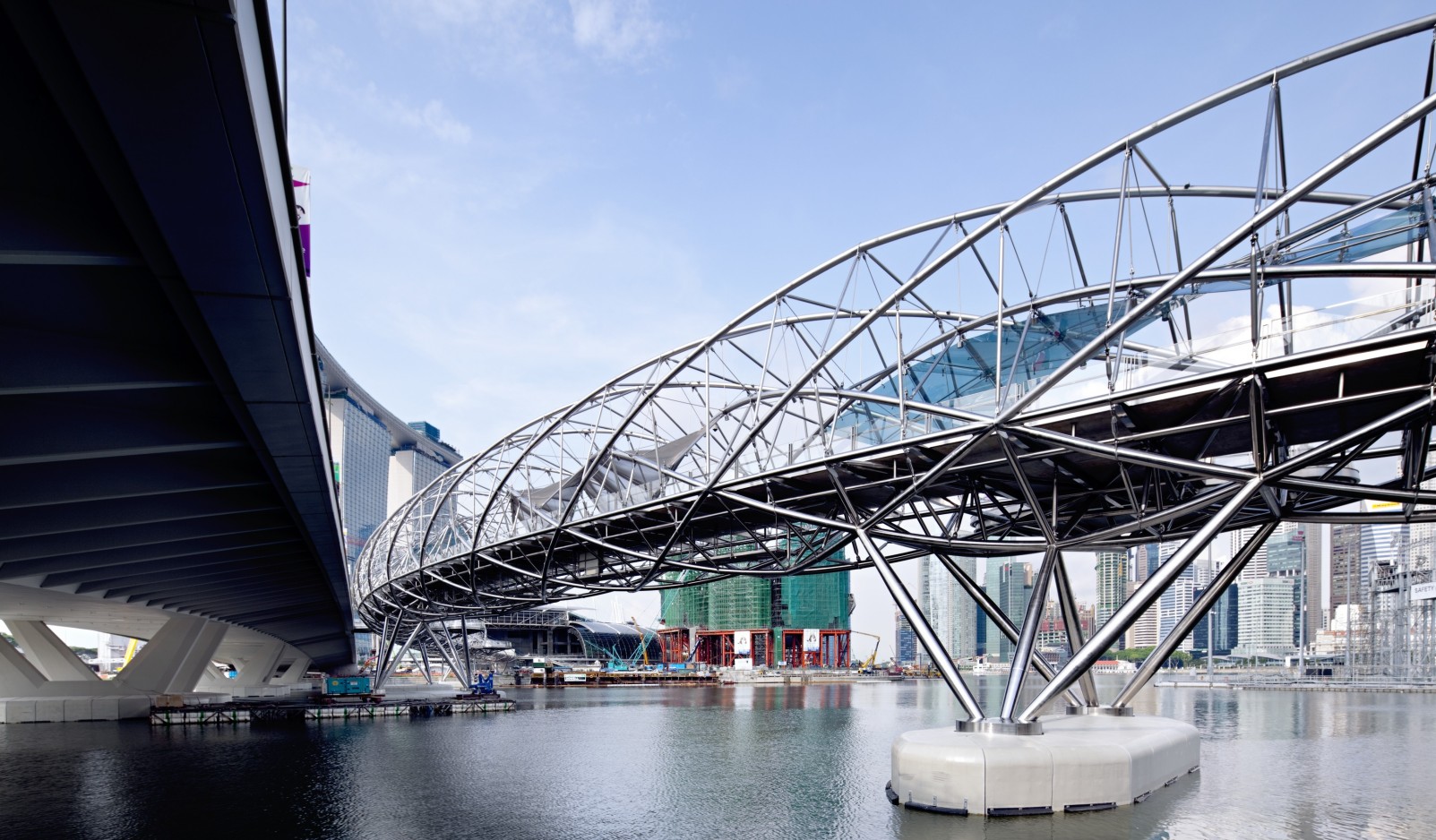
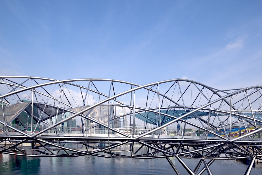
Name: Helix Bridge
Location: Singapore
Description:
This bridge was opened on the 18th of July 2010 and links Marina South and Marina Centre in the Marina Bay area of Singapore. Designed by an Australian architecture firm, Cox Architecture, it was inspired by 'the geometric arrangement of a DNA strand, resulting in a walkway that is enclosed by opposing double-helix structures of stainless steel.'
Spanning 285 metres and costing $82,900,000 Singaporean Dollars, the pedestrian bridge aims to provide a lightweight design which attempts to disconnect the pedestrians with the traffic surrounding it.
Un-altered Floor Plan
Altered Floor Plan
90 Degree Section
Model Re-imagined as 3D in Sketch-up
Background:
The floor plan taken from the PDF is extremely linear, focusing mainly on rectangular shapes and 90 degree edges. However, the space in the floor plan is not enough to accommodate all the rooms needed for the university.
To alter the floor plan, I decided to keep to simple and straight forward design, whilst adding a few elements which will make the space more friendly for the users.
This follows the article which inspired the sentence "In architecture, simplicity is an under-appreciated quality which synthesises the best combination of clear organisational structure, unlimited modification opportunities, and an improved comprehension from both the designer and the user."
Since I believe the simple and linear design is an advantage of the floor plan, I decided to follow through and add another section which is almost a mirror reflection of the existing space. Then, by creating a bridge section which contains 3 levels, it is able to accomodate all the necessary rooms and study space. Whilst the students only need to walk straight to reach the other side of the bridge, they can simple enter a computer lab or library by walking up and down the stairs. Therefore, the middle level is the bridge/walkway component whilst to upper and lower levels have been modified for other uses.
On top of this, a seperate section has been constructed to act as a gallery. This section spans over the road connecting the building on main campus to NIDA building. By using materials such as glass, the gallery can be viewed by the general public who drive by or walk on the street.
Week 3 - Textures
Textures Applied to Model No.1
Textures Applied to Model 2
Textures Applied to Model 3
Moving Component
Moving Component 1: Rotating Shelter
The two rotating shelters are able to be adjusted to allow sunlight in or protect the users from rain. When not needed, they will be turned inwards towards the building. When needed, they would rotate to any angle which will provide shade or protection from the rain. Not only does it have functionality, it also alters the view users can have of the exterior surrounding as well as viewers of the architecture development.
Moving Component 2: Sectioned Travelator
These two travelator move across the bridge, from one end to another which allow students to stand on top of them and be transported to a classroom or another location. This is inspired by the Lexus Hoverboard which moves from one location to another by travelling over a magnetic track and using superconductors. Since the university does not have a travelator, by incorporating a high-tech item which does the same job will bring efficiency to movement across this area. It also alters the perspective seen by a user of the interior of the architecture every section as they change locations.
Peer Review
Peer Review #1
Peer Review #2
Final Design
Conclusion
Lumion Link
https://www.dropbox.com/s/dnnphrc26n7bqur/ARCH1101%20Exp2%20Kathy%20Chen.skp?dl=0
Sketch-up Link
https://www.dropbox.com/s/0bh0isvyy925d5w/EXP2%20z5206054.ls10t?dl=0
Aiming for both simplicity and practicability, the bridge encapsulates a clear walkway connecting multiple areas of the university as well as engaging with layered and lateral design to establish necessary spaces for offices and workshops. By incorporating moving elements and distinct textures, it engages the user by drawing attention to the flow of the structure's organisation as well as placing attention on unique components such as the gallery bridge whilst maintaining a level of organisation.
https://www.dropbox.com/s/dnnphrc26n7bqur/ARCH1101%20Exp2%20Kathy%20Chen.skp?dl=0
Sketch-up Link
https://www.dropbox.com/s/0bh0isvyy925d5w/EXP2%20z5206054.ls10t?dl=0
Video



No comments:
Post a Comment